Trail Mix: Meck


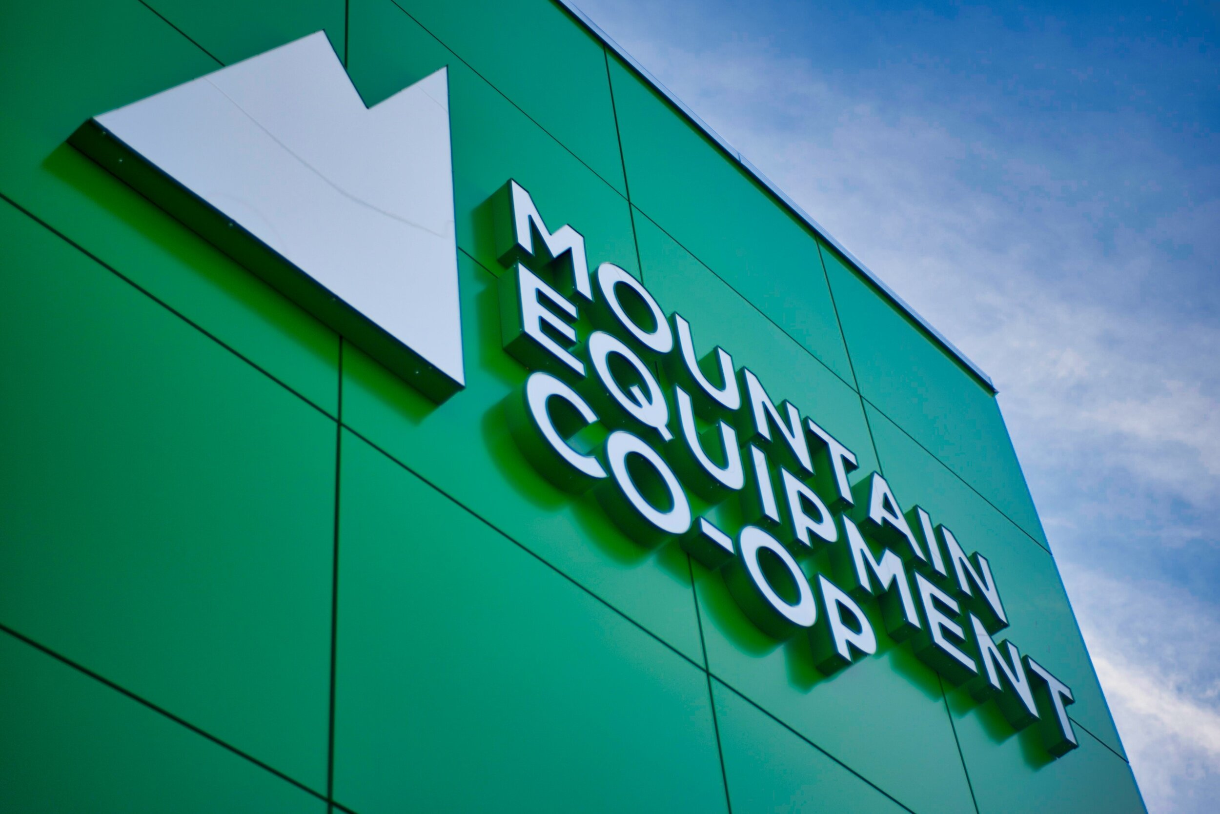
Researchers say that we can recognize brands as young as three years old. While I can't remember back that far, I do remember back-to-school shopping when my parents would take me down to John Street in Toronto to visit Mountain Equipment Co-op. As a special treat in grade school, I was allowed to pick out a new knapsack and head downstairs to try on a new pair of hiking boots. Even through the gear was expensive, it taught me to appreciate things that were well made and to look after them. Although the store has moved to the current King Street location, I remember the hardwood floors, the mountain logo emblazoned on everything, a naturally well-lit store and racks of various clothing, gear and canoes on display. There was something special about this store which I immediately fell in love with (although I didn't quite understand why you had to have a share).
Over the years I have continued shopping at MEC, purchased my very own share, bought piles of camping gear and clothing there...and proudly visited all of the stores in Ontario. As I grew, so did the store... more stock, more selection... and recently... a diversity in the types of activities they support. Stocking bicycles was the first sign that big changes were on the way...
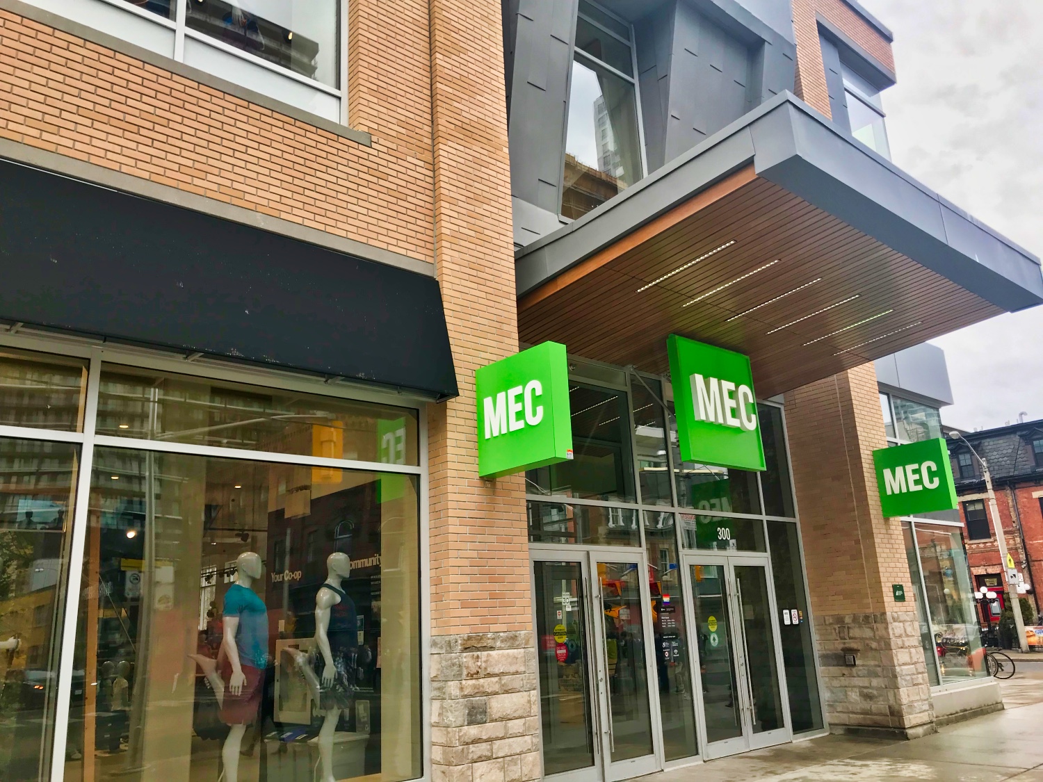
MEC sent out surveys every so often that were well done, and very topical. They were reaching out and asking questions such as "Do you read the catalogue?", "What would you like in a digital app?" and "Do you pronounce MEC... 'Emm-Ee-Cee' or 'Meck'?". I guess the market research showed that catalogues were no longer needed (although I miss my bathroom reading material... but thankful we're saving trees), there is a great MEC iOS app, but the real shocker wasn't revealed until yesterday, when 'Emm-Ee-Cee', turned into 'Meck'.
The classic, iconic mountain logo is no more, and replaced with a rather ho-hum generic logo of the MEC lettering surrounded by a square box. I am quite disappointed. Disappointed enough to write a "Dear Internet" blog post.
Apple's logo once had six colours, but upon Steve Jobs' return in the late '90s, it was dropped for a solid single colour, which was to make them appear more modern. While I miss the old rainbow logo, the new one is sharp and still shows the connection to the past. Sadly, the same isn't the case for the new MEC logo.
In the end, I am glad MEC's initiative is to get more people outside and to enjoy adventures, because that is the exact same goal as Traversing... I'm just sad that the very logo which I first found inspiring so long ago, is no longer considered a reflection of the brand.
You can read more about the design of the new logo on MEC's blog.